How To Make A Frequency Distribution

Hey there, data enthusiast! (Or, you know, data-curious person!) Ever feel like you're drowning in a sea of numbers? Like you're surrounded by information but can't quite see what it's telling you? Well, fear not! Today, we're diving into the wonderfully accessible world of frequency distributions. Trust me, it's not as scary as it sounds. In fact, it can be downright fun!
What's the Big Deal with Frequency Distributions?
Okay, so what is a frequency distribution, anyway? Simply put, it's a way to organize data to show how often each value (or group of values) occurs. Think of it like sorting your socks. Instead of a jumbled mess in your drawer, you group them by color or type. A frequency distribution does the same for your data. Pretty neat, right?
Why bother? Because it turns a chaotic mess of numbers into a clear, visual story. You can quickly spot trends, identify the most common occurrences, and get a much better grasp of what your data is actually saying. Think about it: Is your online shop selling more of blue shirts than red ones? How many students scored in each grade range on a test? Frequency distributions give you the answers!
Must Read
Let's Build One! (It's Easier Than You Think!)
Ready to get your hands dirty? Don't worry, you won't need any special software or a PhD in statistics. We'll walk through it step-by-step. You can follow along with any dataset you like – maybe the number of cups of coffee you drank each day this week, the ages of your friends, or the scores from your last video game session. Anything goes!
Step 1: Gather Your Data. This is the easy part! Just collect all the individual data points you want to analyze. Write them down, put them in a spreadsheet – whatever works for you.
Step 2: Determine Your Classes (or Bins). This is where we group the data. If you have a relatively small range of values (like grades from A to F), you can use each individual value as a class. But if your data spans a wider range (like ages from 1 to 100), you'll want to create bins, or intervals. For example, you might group ages into 1-10, 11-20, 21-30, and so on. Choosing appropriate bin sizes is key! Too few bins, and you lose detail. Too many, and the distribution might be too granular to see clear patterns.
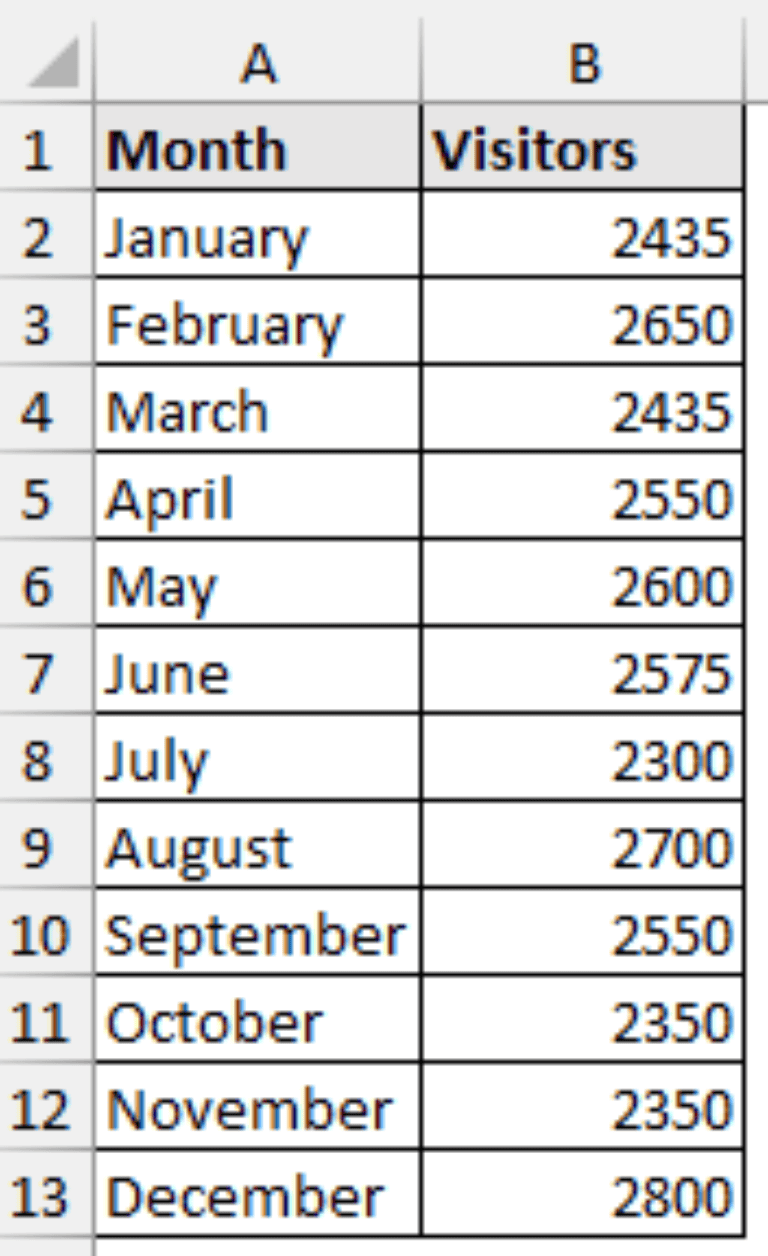
Step 3: Tally the Frequencies. This is the heart of the process. Go through your data and count how many values fall into each class or bin. This is your frequency – how often each value or group of values occurs.
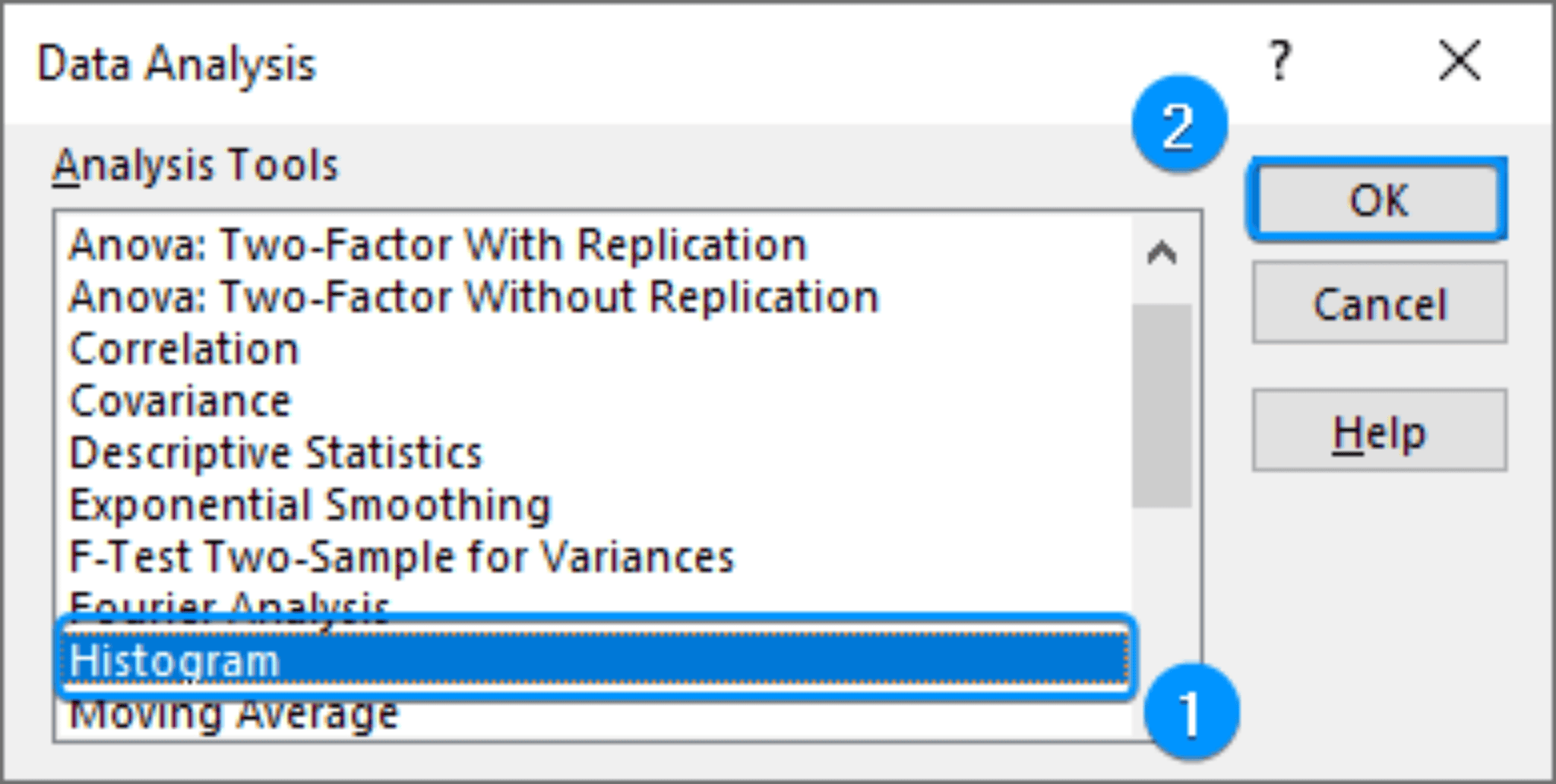
Step 4: Create Your Table or Chart. Now, present your results! A simple table with two columns (classes/bins and frequencies) works perfectly. Or, you can get fancy and create a histogram (a bar chart where the height of each bar represents the frequency) or a frequency polygon (a line graph connecting the midpoints of each bin). Choose the visualization that best communicates your data.
Example Time! (Because Everything's Better with Examples)
Let's say we surveyed 20 people about how many books they read last year. Here's the raw data:
5, 2, 8, 1, 3, 5, 7, 4, 2, 6, 5, 9, 3, 4, 5, 6, 2, 4, 7, 5
We could create bins like this: 1-2, 3-4, 5-6, 7-8, 9-10.
After tallying, our frequency distribution might look like this:

- 1-2 books: 3 people
- 3-4 books: 5 people
- 5-6 books: 7 people
- 7-8 books: 3 people
- 9-10 books: 2 people
See? Now you can easily see that most people read between 5 and 6 books last year. Cool, huh?
Making it Fun: Real-World Applications!
Okay, so we've covered the basics. But how can you actually use this in your life? Here are a few ideas:
- Track your spending: Create a frequency distribution of your expenses to see where your money is going.
- Analyze your workouts: Track the number of reps you do for each exercise to see how you're progressing.
- Improve your game: Analyze your scores in a video game to identify areas for improvement.
- Understand customer behavior: If you run a business, use frequency distributions to analyze sales data and understand what your customers want.
The possibilities are endless! Seriously, once you start thinking in terms of frequency distributions, you'll find opportunities to use them everywhere.
Beyond the Basics: Level Up Your Data Skills
We've only scratched the surface here, but hopefully, you're feeling inspired to learn more. Want to take your data analysis skills to the next level? Explore concepts like relative frequency (the proportion of values in each class), cumulative frequency (the total number of values up to a certain class), and different types of distributions (like normal, skewed, and uniform). There's a whole world of data exploration waiting for you!
So go ahead, embrace the power of frequency distributions! Transform your data from a confusing mess into a clear and insightful story. You might be surprised at what you discover! And remember, learning is a journey, not a destination. Have fun exploring the world of data!