The Quantity Q3 Q1 Is Known As The
.jpg)
Hey there, data adventurers! Ever stumbled upon a weird phrase in a spreadsheet and thought, "What in the statistical world is that?!" Well, today we're cracking the code on one of those phrases: "The Quantity Q3 - Q1." Sounds intimidating, right? But trust me, it's way more exciting than it looks!
What is Q3 - Q1, anyway? Drumroll, please... It's known as the Interquartile Range! (Or IQR, if you're feeling abbreviations.)
So, What's the Big Deal with the Interquartile Range?
Okay, I get it. You might be thinking, "Another statistical term? Seriously?" But stick with me! The IQR is actually a super helpful tool for understanding your data and making smarter decisions. It's like having a secret decoder ring for figuring out what's really going on in your numbers. And who doesn't love a good secret decoder ring?
Must Read
Imagine you have a bunch of numbers – maybe they represent sales figures, test scores, or even the number of squirrels you saw in your backyard last week (hey, no judgment!). The IQR helps you see how spread out those numbers are.
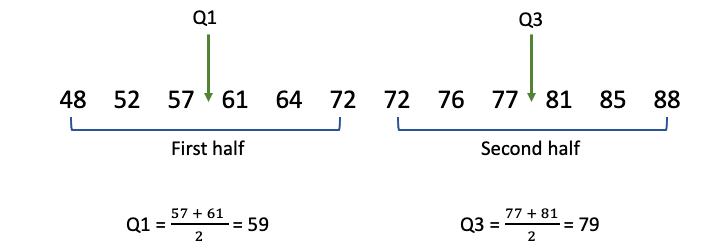
Think of it like this: you line up all your numbers from smallest to largest. The median (Q2) is the number right in the middle – it splits your data in half. Now, the IQR focuses on the middle 50% of your data. It chops off the really low numbers (the bottom 25%) and the really high numbers (the top 25%) and looks at what's left.
Decoding Q1 and Q3
Let's break down those Q's, shall we?

Q1 (Quartile 1) is the median of the lower half of your data. It's the point where 25% of your data falls below. Think of it as the "bottom cutoff" for the middle 50%.
Q3 (Quartile 3) is the median of the upper half of your data. It's the point where 75% of your data falls below. This is the "top cutoff" for the middle 50%.
So, when you subtract Q1 from Q3 (Q3 - Q1), you get the IQR. This tells you the range within which the middle 50% of your data lies. Pretty neat, huh?

Why is that useful? Well, consider this example: Let's say you're analyzing the salaries of employees at two different companies. Both companies might have the same average salary. But if Company A has a much larger IQR than Company B, that means the salaries at Company A are more spread out. There might be a few very high earners pulling up the average, while many employees are earning less.
Why Should You Care About IQR?
Here's the deal: averages can be misleading! They can be skewed by extreme values (those pesky outliers). The IQR gives you a more robust measure of spread, meaning it's less affected by those outliers.
Let's say you're tracking the time it takes you to commute to work. Most days, it takes you 30 minutes. But one day, you hit crazy traffic and it took you an hour and a half! That one outlier could significantly inflate your average commute time.
But the IQR would give you a more accurate picture of your typical commute time, because it ignores the really high and really low values.
So, what can you DO with this knowledge?
* Spot Outliers: A large IQR can indicate the presence of outliers. * Compare Datasets: You can compare the spread of different datasets, even if they have the same average. * Make Better Decisions: By understanding the spread of your data, you can make more informed decisions in all areas of your life, from finance to fitness to (yes!) figuring out where to live.:+The+IQR+is+the+range+between+Q3+to+Q1.+It+is+calculated+by+subtracting+Q1+from+Q3:+Q3+–+Q1+%3D+IQR..jpg)
Let's Get Practical!
You can calculate the IQR using a spreadsheet program like Excel or Google Sheets. There are built-in functions to calculate quartiles (usually `QUARTILE.INC` or `QUARTILE.EXC`, depending on whether you want to include the median in the calculations) . Just pop in your data, run the functions, and boom! You have your Q1, Q3, and IQR. There are also countless online calculators if you prefer a point-and-click approach.
Seriously, give it a try! Grab some data – your expenses from last month, your workout times, the scores from your last video game competition... Anything! Calculate the IQR and see what you discover. You might be surprised at what you find.
And that, my friends, is the magic of the Interquartile Range. It’s a little slice of statistical awesome that can help you make sense of the world around you. It's all about getting a handle on your data, one quartile at a time!
So, go forth and explore! The world of data is waiting, and the IQR is your trusty sidekick. You got this!