The Production Possibilities Curve Shows That
Okay, so imagine this: You're at a pizza party. There's only one pizza, a massive, glorious pie. But here’s the catch: you can only choose pepperoni or mushroom slices. No fancy combinations allowed, sadly. You could go all-in on pepperoni, ignore the mushrooms completely, or vice-versa. Or you could have a mix, right? Some slices of each. But every slice of pepperoni you grab means one less slice of mushroom. Bummer!
That, my friends, in a nutshell, is what the Production Possibilities Curve (PPC) is all about. It's not literally about pizza (though, wouldn’t that be a fun class?), but about choices. More specifically, the trade-offs we face when producing stuff with limited resources.
So, What Does the PPC Actually Show?
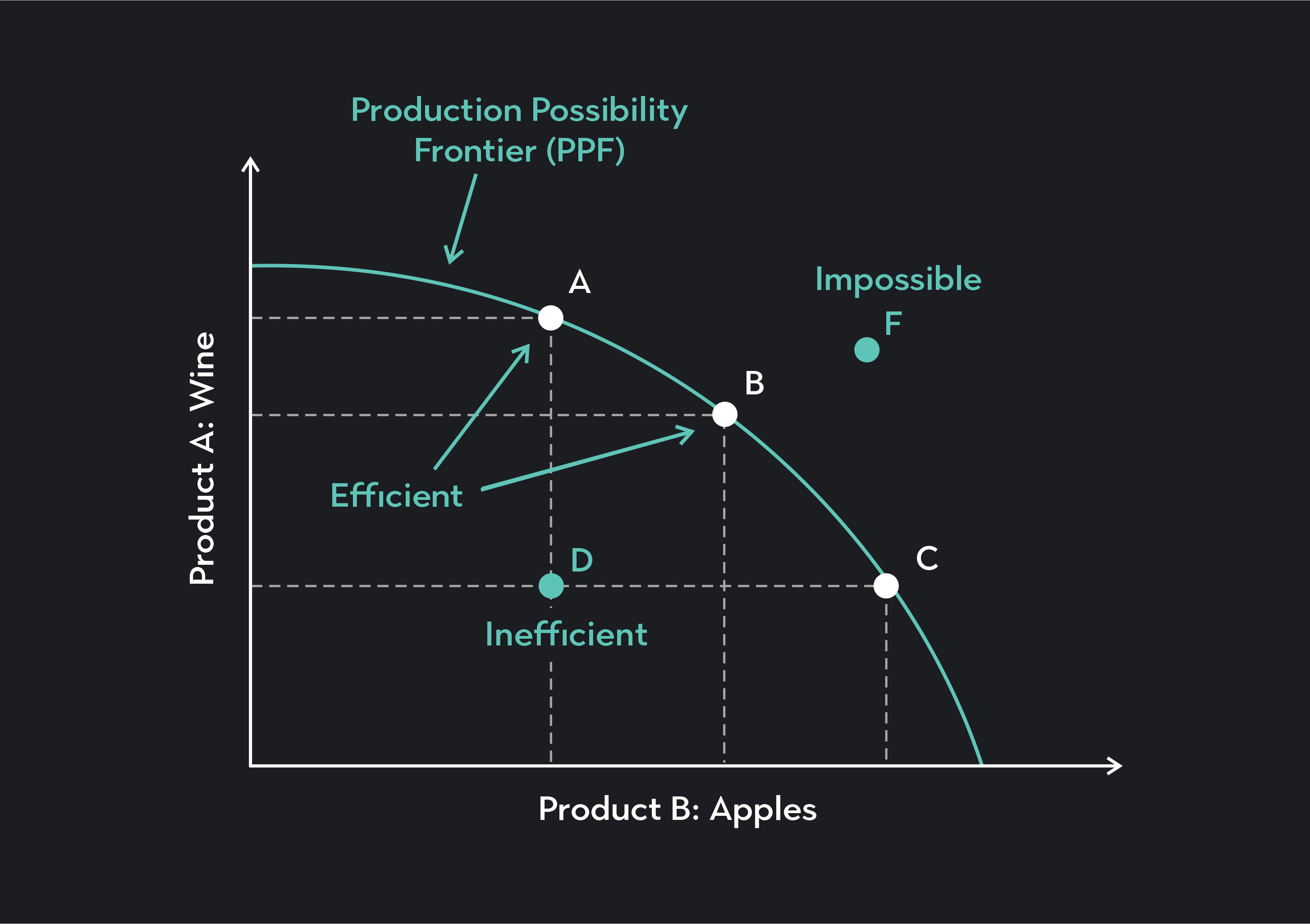
The PPC is a visual representation of the maximum potential output of two goods or services, given a fixed set of resources and technology. Think of it as a line in a graph – a curved line, usually – showing you all the possible combinations you can produce.
Must Read
Key Takeaway #1: Scarcity is Real. Remember the pizza party? We only had one pizza! The PPC highlights that resources (labor, capital, land, raw materials) are limited. You can’t produce infinite pepperoni and infinite mushrooms. There's a ceiling, a constraint. That's scarcity staring you right in the face.
This scarcity forces us to make choices. Important decisions! What do we want to prioritize? More pepperoni? More mushrooms? A balanced approach? The PPC shows us the consequences of those choices.

Opportunity Cost: The Hidden Price Tag
Here’s where things get interesting. Every time you choose to produce more of one good (say, pepperoni), you’re giving up the opportunity to produce some of the other (mushrooms). That sacrifice is called the opportunity cost. It's the value of the next best alternative you're foregoing. Basically, what you could have had.
Key Takeaway #2: Opportunity Cost is Everywhere. On the PPC, the opportunity cost is reflected in the slope of the curve. A steeper slope means a higher opportunity cost – you're giving up a lot of one good to get a little more of the other. A flatter slope? Lower opportunity cost. (Yeah, math is involved, but don't panic! Think of it visually.)

For example, imagine a country deciding between producing tanks and producing tractors. If they decide to produce more tanks, they have to reallocate resources (steel, labor, etc.) away from tractor production. The opportunity cost of those extra tanks is the number of tractors they had to sacrifice. (Think of the political implications of that decision, too!)
Efficiency vs. Inefficiency: Are You Using Your Resources Wisely?
The PPC also reveals how efficiently resources are being utilized. Any point on the curve represents productive efficiency. This means that all available resources are being used to their fullest potential, producing the maximum possible output. No waste!
Points inside the curve indicate inefficiency. This means that the economy (or, you know, the pizza maker) could be producing more of both goods. Maybe there's unemployment, or resources aren't being allocated effectively. Think of it as wasted potential. Nobody wants that!
Key Takeaway #3: Get on the Curve (and Stay There!). Any point outside the curve is currently unattainable. That’s beyond the current resource and tech limits. It’s like wanting a pizza with 200 slices when you only have enough dough for 100. You’d need more resources or better technology (a magical pizza oven, perhaps!) to reach that point.
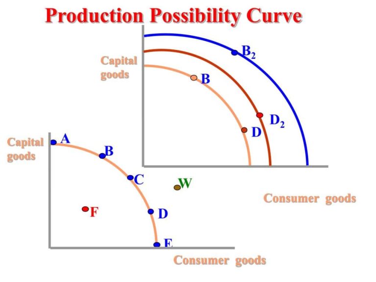
Economic Growth: Shifting the Curve Outward
But what if you could magically get more resources or a better oven? That's where economic growth comes in. Economic growth allows us to shift the PPC outward, expanding our production possibilities. It's like getting a bigger pizza and the freedom to choose from more toppings!
Key Takeaway #4: Growth is Good (Usually). Technological advancements, increased labor force, or discovering new resources can all lead to economic growth, shifting the PPC outward and allowing us to produce more of both goods. Basically, better and more stuff for everyone! Unless, of course, that growth comes at the expense of something else important, like environmental sustainability. Trade-offs are everywhere!
So, the next time you're faced with a choice (pizza related or otherwise), remember the Production Possibilities Curve. It's a powerful tool for understanding scarcity, opportunity cost, and the importance of using resources efficiently. And maybe, just maybe, it'll help you make better decisions. (Especially about pizza.)