How Do You Change Your Color Sync In Illustrator

Ever feel like the vibrant reds you meticulously chose in Illustrator suddenly look…blah? Like a deflated balloon animal of color? Chances are, you've stumbled upon the fascinating world of ColorSync. Think of it as your digital interpreter for color – ensuring consistency across different devices and software. But sometimes, that interpreter needs a little…guidance. Let's dive into how you can fine-tune your ColorSync settings in Illustrator and bring those hues back to life!
Understanding Color Profiles: The Foundation
Before we get our hands dirty, a quick ColorSync 101. ColorSync relies on color profiles, which are essentially tiny files that tell your devices (monitor, printer, scanner, etc.) how to reproduce color accurately. Different devices have different color gamuts (the range of colors they can display). ColorSync tries to bridge the gap, ensuring a relatively consistent experience. Think of it like trying to translate a poem. The nuance might get lost, but the core meaning should remain.
Imagine you're designing a website. You're using a beautiful, vibrant color palette on your calibrated monitor. You send the files to a client, and they view it on their uncalibrated screen. Suddenly, your perfect teal looks suspiciously like muddy green! That's where ColorSync and proper color profile management come into play.
Must Read
Changing Your Color Settings in Illustrator: The Nitty-Gritty
Okay, let's get practical. Here's how you can adjust your ColorSync settings within Illustrator:
- Open Illustrator. (Duh!)
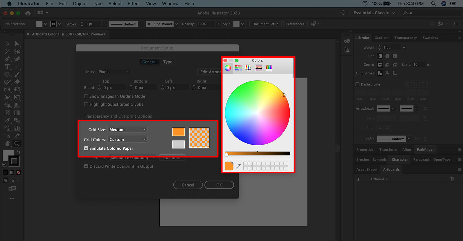
- Go to Edit > Color Settings (or press Shift+Ctrl/Cmd+K).
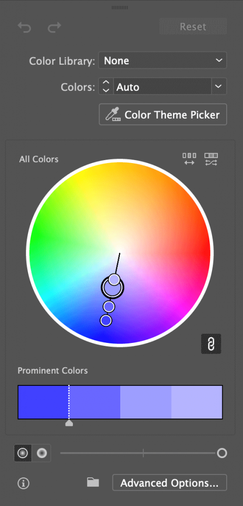
- The Color Settings dialog box is your command center.
Now, this is where things get interesting:
- Settings: This dropdown offers predefined settings like "North America General Purpose 2" or "Europe General Purpose 3." These are good starting points, but not always ideal.
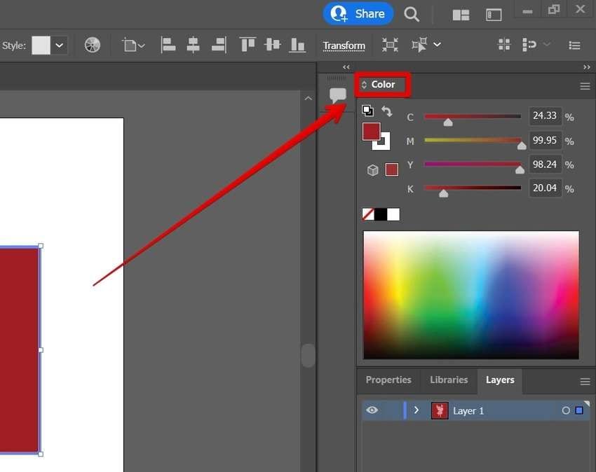
- Working Spaces: Here's where you choose the color profiles Illustrator will use for different color modes (RGB, CMYK, Gray).
Pro Tip: If you're primarily designing for web, stick with sRGB as your RGB Working Space. It's a common standard, and most web browsers handle it well. For print, CMYK profiles like US Web Coated (SWOP) v2 are often used, but always consult your printer for their recommended profile.
Assigning Profiles vs. Converting to Profiles
These terms are crucial! Assigning a profile simply tells Illustrator to interpret the existing color data using the new profile. It doesn't change the underlying color values.
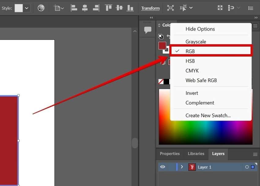
Converting to a profile, on the other hand, does change the color values to match the new profile. This is a more drastic step and can alter the appearance of your artwork.
Think of it like this: Assigning is like putting on a different pair of sunglasses; the world looks different, but the world itself hasn't changed. Converting is like repainting the world.
Generally, you want to assign profiles when working with images from different sources. You'll want to convert when preparing files for a specific output (like printing), and your printer requires a specific profile.
Practical Tips and Tricks
- Calibrate Your Monitor: This is the single most important thing you can do for accurate color. Invest in a monitor calibrator (like a SpyderX or i1Display) or hire a professional.
- Work in a Controlled Lighting Environment: Avoid working under direct sunlight or harsh fluorescent lights. Consistent, neutral lighting is key.
- Communicate with Your Printer: As mentioned before, always get their recommended color profiles. They're the experts when it comes to print output.
- Use Proof Setup: In Illustrator, go to View > Proof Setup to simulate how your artwork will look when printed on a specific device. This lets you catch potential color issues early on.
- Embrace the Hex Code: When sharing colours, Hex codes are universal, and reduce the risk of misinterpretation.
ColorSync and the Everyday Designer
ColorSync might seem like a highly technical topic, but understanding its basics empowers you to have more control over your creative output. It's about ensuring that your artistic vision is translated accurately, from your screen to the final product. And it all starts with navigating the world of colour profiles and settings, remember, consistency is key.
Ultimately, it's a lesson in managing expectations. We can't perfectly replicate the same color experience across every device, but with careful calibration, profile management, and a little bit of knowledge, we can get pretty darn close.