
Rotate X Axis Labels Ggplot

Let's talk about something near and dear to the heart of anyone who's ever wrestled with data visualization: rotating those pesky x-axis labels in ggplot. You know, when your chart looks like a perfectly good shelf...until you try to cram all your books (or, in this case, labels) onto it, and they start overlapping in a chaotic, unreadable mess.
Ever tried squeezing into a crowded elevator? That's what your x-axis labels feel like when they're all trying to stand upright and shout their names at the same time. It's a cacophony of letters! And nobody wants to read a graph that requires a degree in deciphering overlapping text.
That's where rotating your x-axis labels comes in. It's like giving everyone in that elevator a chance to breathe, maybe even sit down. Suddenly, there's order! There's legibility! There's…understanding!
Must Read
Why Bother?
Okay, so why bother with this whole rotation thing? Why not just…ignore the problem and hope nobody notices? Well, because clear communication is king (or queen!). Your beautiful data masterpiece is utterly useless if nobody can actually read it. Think of it like this: you spent ages baking a gourmet cake, but you serve it covered in a thick layer of mud. Nobody's going to appreciate the delicate flavors underneath!
Imagine you're presenting to your boss, and your graph is a visual train wreck because the x-axis labels are battling for dominance. Not a great look, right? You want to look like you know what you're doing. You want to radiate competence. You want to be the chart-whisperer! (Okay, maybe not that last one, but you get the idea.)

The Secret Sauce: `theme()`
So, how do we become x-axis-label-rotating masters? The magic word is `theme()`. In ggplot, `theme()` is your Swiss Army knife for customizing pretty much anything. And when it comes to x-axis labels, it's your best friend.
We're specifically interested in the `axis.text.x` element within `theme()`. This allows you to control the appearance of, you guessed it, the text on the x-axis.

Here’s the basic recipe:
ggplot(your_data, aes(x = your_x_variable, y = your_y_variable)) +
  geom_bar(stat = "identity") + # Or whatever geom you're using
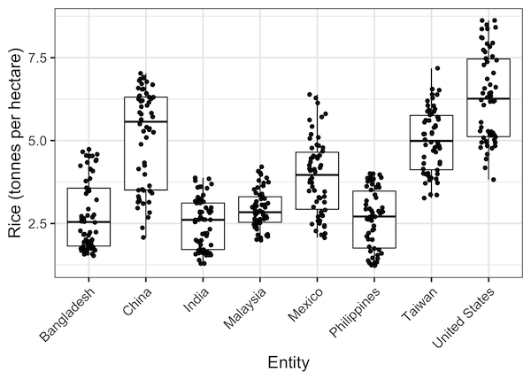
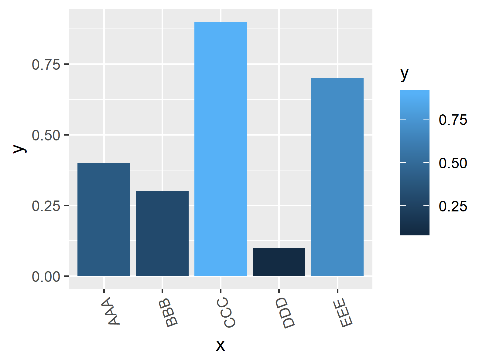
  theme(axis.text.x = element_text(angle = 45, hjust = 1))
Let's break that down:
- `angle = 45`: This is where the rotation happens! `45` degrees is a good starting point, but feel free to experiment. Go wild! (Just not too wild.)
- `hjust = 1`: This is crucial. `hjust` stands for "horizontal justification." Setting it to `1` anchors the text to the right. Without this, your rotated labels might look a little…off-kilter. It's like trying to hang a picture perfectly straight without a level. Frustrating!
Pro Tip: Play around with different angles. Sometimes `90` degrees works best, sometimes `30` is the sweet spot. It all depends on the length of your labels and the overall aesthetic you're going for.
Fine-Tuning Your Rotations
But wait, there's more! Sometimes, even after rotating, your labels might still be a little too close for comfort. Fear not! You can also adjust the size and font of your labels to further improve readability.
Add these to your `element_text()` call:
- `size = 10`: Adjust the font size. Smaller is sometimes better.
- `color = "gray50"`: Change the color. A subtle gray can be easier on the eyes than stark black.
- `face = "bold"`: Make the labels bold for extra emphasis. (Use sparingly!)
Remember: The goal is clarity. You want your graph to be informative and visually appealing, not a confusing jumble of letters and lines.
A Final Word (or Two)
Rotating x-axis labels in ggplot is a simple technique, but it can make a huge difference in the clarity and impact of your visualizations. So, the next time you're struggling with overlapping labels, don't despair! Just remember the magic of `theme()` and `element_text()`, and you'll be rotating like a pro in no time.
Now go forth and create beautiful, readable graphs! Your data (and your audience) will thank you.