Puco Apples To Apples Comparison Chart Ohio

Ever feel like your utility bills are speaking a secret language you weren't invited to learn? Like you're just paying whatever number shows up, crossing your fingers, and hoping for the best? We've all been there! It’s like trying to choose cereal in a grocery store when you're half-asleep – too many options, too much tiny print, and you just want to grab something and go.
But what if I told you there’s a super helpful, totally free tool right here in Ohio that makes understanding and choosing your energy supplier as easy as, well, choosing an apple over an orange? Enter the PUCO Apples to Apples Comparison Chart Ohio. Sounds a bit official, right? Don't let the name fool you. This isn't some dry government document. Think of it more like your savvy friend who always knows where to get the best deal, but for your electricity and natural gas!
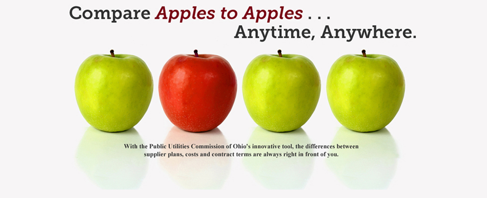
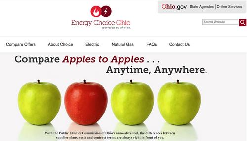
So, What’s the Big Deal with "Apples to Apples"?
Imagine you're at the farmer's market. You see a vendor selling Gala apples for $3 a pound, and another selling them for $2.50 a pound. You wouldn't just grab the first one, would you? You'd compare! That's exactly what the PUCO Apples to Apples Comparison Chart does for your energy. In Ohio, you actually have a choice when it comes to who supplies your electricity and natural gas. Your local utility (like AEP, Duke Energy, Columbia Gas, etc.) still delivers the energy to your home and handles emergencies. But the actual energy you use can come from different companies, called suppliers.
Must Read
And here’s the kicker: these suppliers can offer different rates and plans! Without a tool like this, it’s like trying to compare those apples by running back and forth between two different markets across town. Exhausting!
Why Should You Care About This Chart? (Spoiler: Your Wallet Will Thank You!)
Let's be real, who doesn't love saving a little cash? We're talking about money that could go towards that extra latte, a fun night out, or maybe even chipping away at that vacation fund.

Think about it like this: You shop around for car insurance, right? You compare phone plans, don't you? You probably even glance at different brands of toilet paper to see which gives you more bang for your buck. So why wouldn't you do the same for something as fundamental as your home's energy? The PUCO chart makes it incredibly easy to see all your options side-by-side. No hidden fees, no confusing jargon – just clear comparisons so you can make an informed decision.
My neighbor, Carol, swore by it. She used to just pay whatever her bill said, grumbling a bit, but never really looking into it. Then her daughter showed her the Apples to Apples chart. Carol found a new supplier that saved her about $20 a month! That’s $240 a year! She now calls it her "extra dessert fund." (And she sends me a postcard from her mini-vacations!)
It's Your Secret Weapon Against Bill Confusion!
Let’s face it, energy bills can be dense. They’re full of terms like "generation charges," "transmission fees," and "distribution costs." It’s enough to make your eyes glaze over faster than a Krispy Kreme donut.
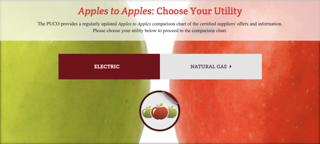
The PUCO Apples to Apples Chart cuts through all that noise. It focuses on the important numbers – the rate you'll pay per kilowatt-hour (kWh) for electricity or per hundred cubic feet (Ccf) for natural gas – and lays them out clearly. You can easily filter by different contract lengths (do you want a fixed rate for 12 months, or a shorter-term variable plan?) and even see if a supplier offers green energy options. It's like having a personal shopping assistant who only cares about getting you the best deal for your energy. No pressure, no sales pitch, just facts.
Taking Control, One Click at a Time
Using the chart is ridiculously simple. You pop onto their website, enter your zip code, and voilà! A list of available suppliers, their rates, contract terms, and even customer reviews appear before your eyes. It’s quick, it’s intuitive, and it puts the power back in your hands. No more feeling powerless against rising bills. No more guessing if you're getting a good deal. This chart empowers you to become a savvy energy consumer, making choices that truly benefit your household budget.
So, next time you're scrolling through your phone, why not take five minutes to visit the PUCO Apples to Apples Comparison Chart Ohio? It might just be the easiest money you save all year. Imagine the satisfaction of knowing you're getting a great deal, simply because you took a moment to compare. Go on, give your wallet a little high-five! You deserve it.